Senior Graphic Design Exhibition Artwork
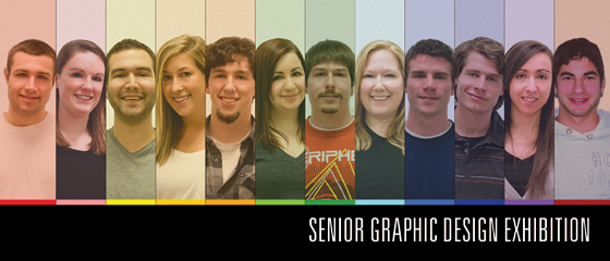
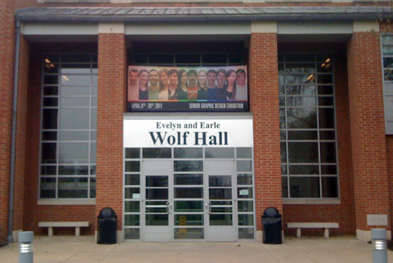
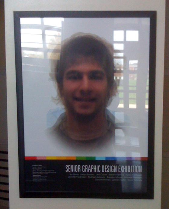
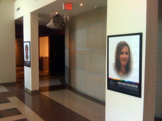
The Senior Exhibition at York was fantastic. A culmination of a years worth of work wrapped up into a final presentation surely paid off. I had the responsibility of branding the show this year, and with 12 designers, it was a challenging task to incorporate everyone. I’ve chosen to display everyone in a 1″ wide section (for the postcards) and roughly 1 foot wide for the banner. Everyone’s eye line was matched and a random color (or one of their liking) was overlaid in a gentle opacity to give a playful feel and to reflect the color choices in the clothing. Below is the postcard front (the back is plain text – no eye candy there), and the concept posters in the gallery lobby. The posters were inspired by a Rick Valicenti work where he had overlaid employees in varying colors. I’ve taken the approach of full color overlays where the end result creates an eerie “extra” designer where everyone’s features are blended together, showing just how similar our features really were. One poster for guys, another for girls.
Excuse the iPhone 3G picture quality.
Filed in: SITE NEWS. You can leave a response, or trackback from your own site.


